For those of you that have been using WordPress elsewhere, there are a few key distinctions you need know about the Aurora server.
Multisite
Aurora is a multisite installation of WordPress, modeled after WordPress.com. Each site has it’s own tables, but they are in one database, and share the same library of plugins and themes.
Plugins
Plugins are controlled at the Network level in Aurora. The addition of any new plugins to the network is decided on by the Aurora Governance Committee.
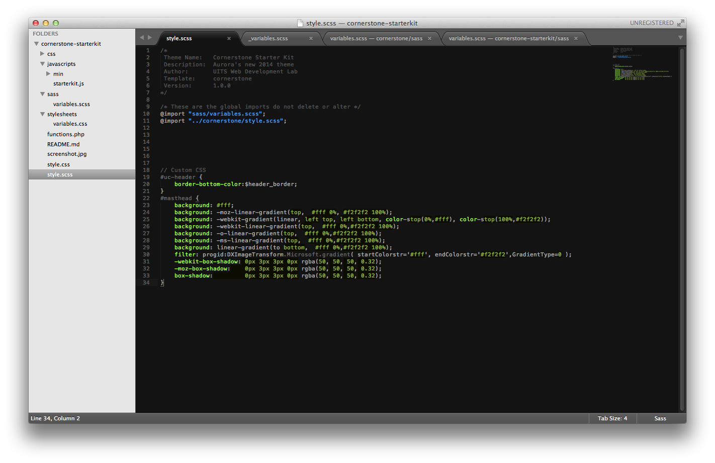
Themes
Similar to plugins, Themes are also controlled at the network level. Custom themes are permitted, but must pass a Code Audit process before being allowed on production.